
Compare Questions
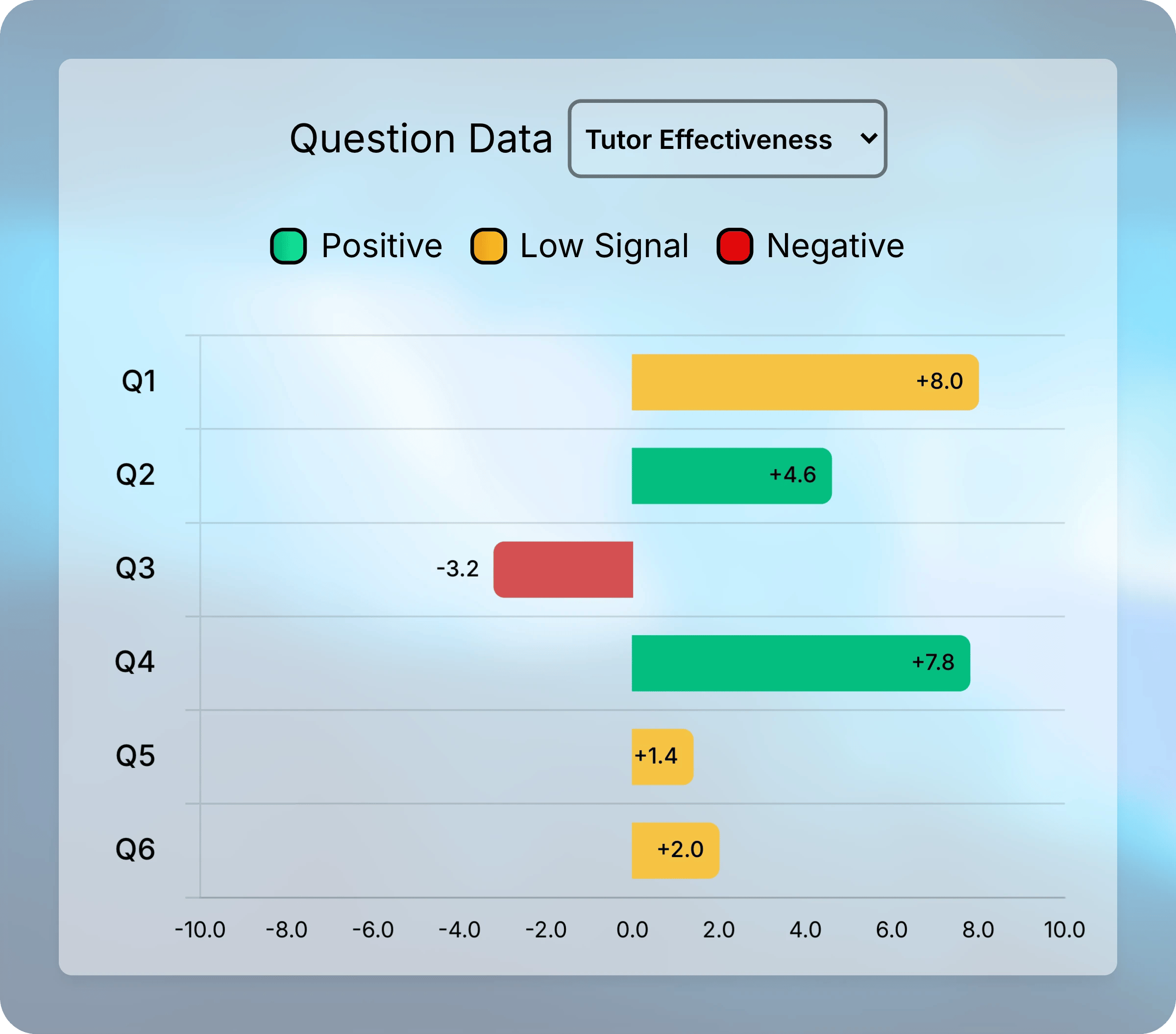
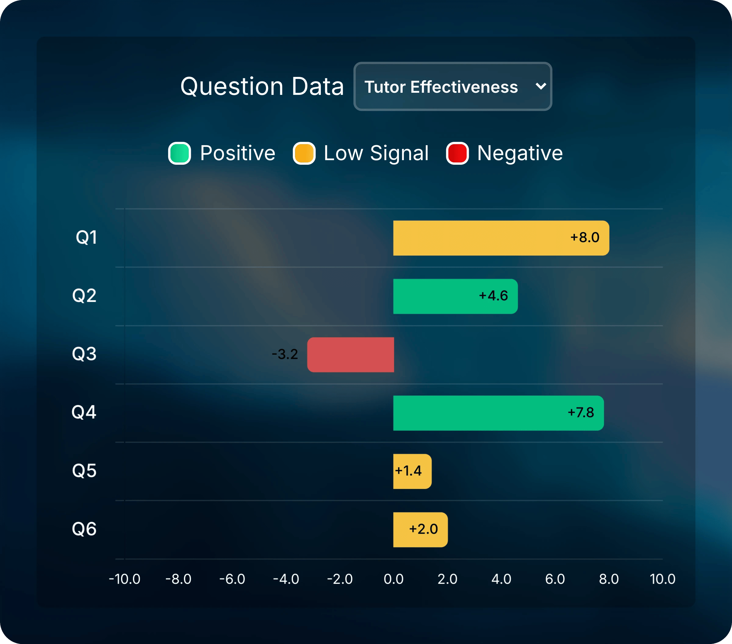
In the teacher dashboard, select the assessment. The Analytics section below the submissions includes Question Data, a chart with one bar per question.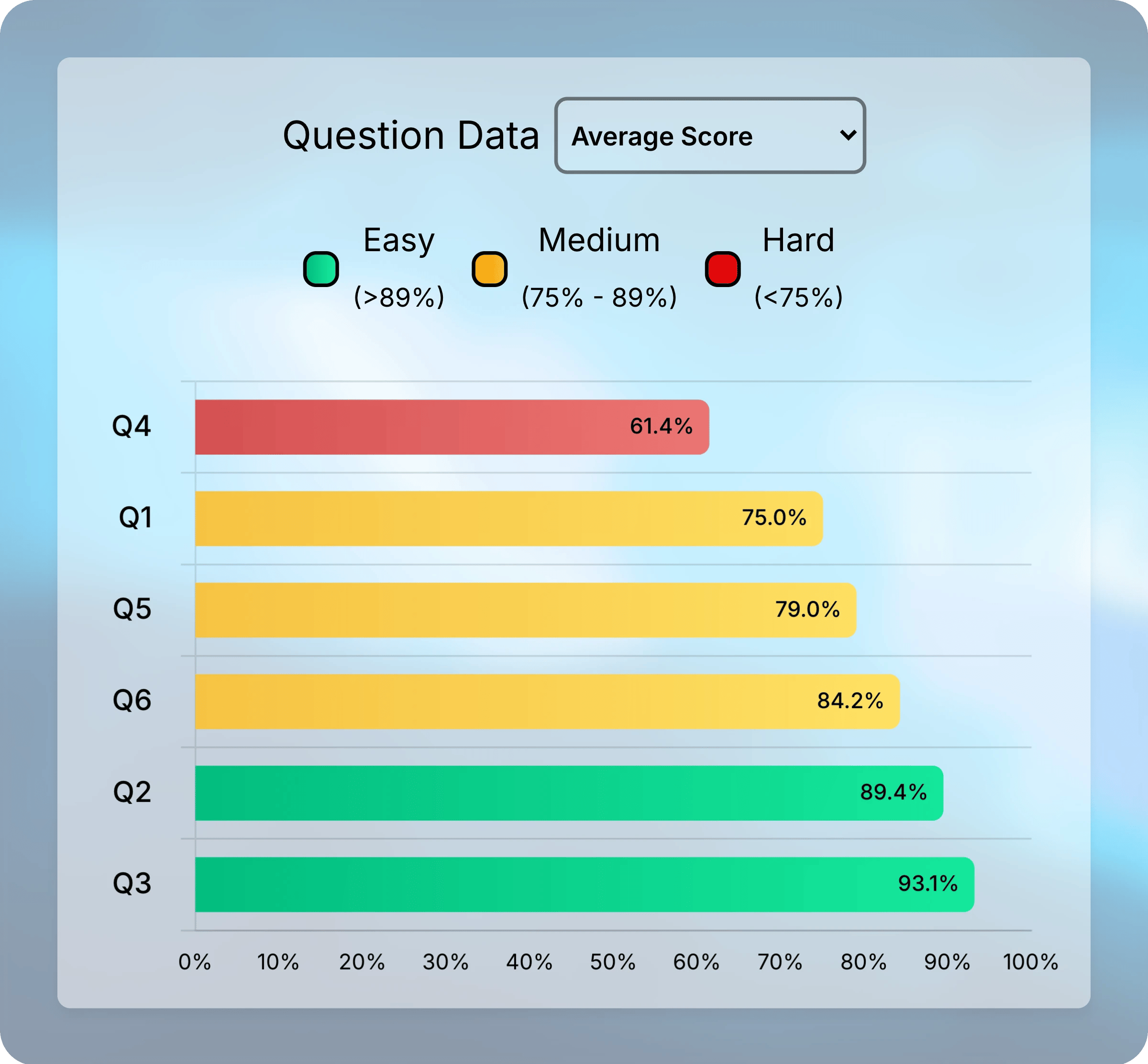
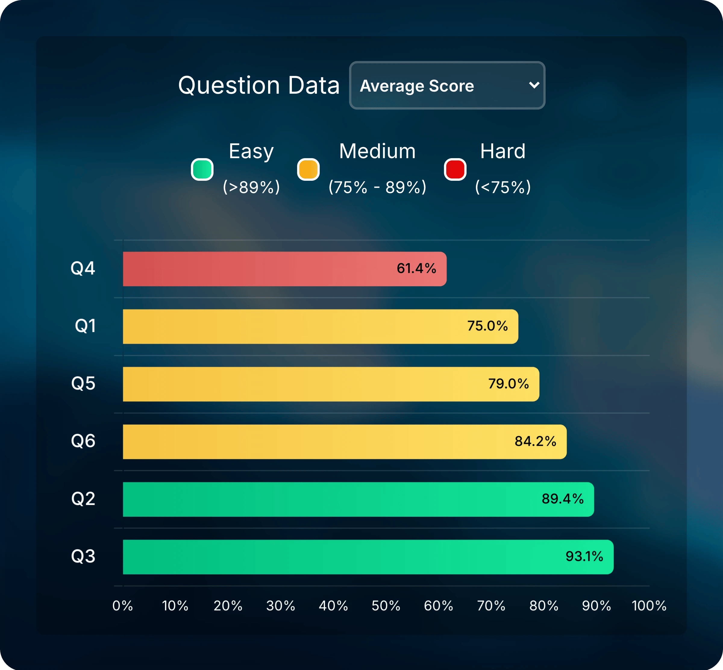
Average Score sorts the questions from lowest to highest score.
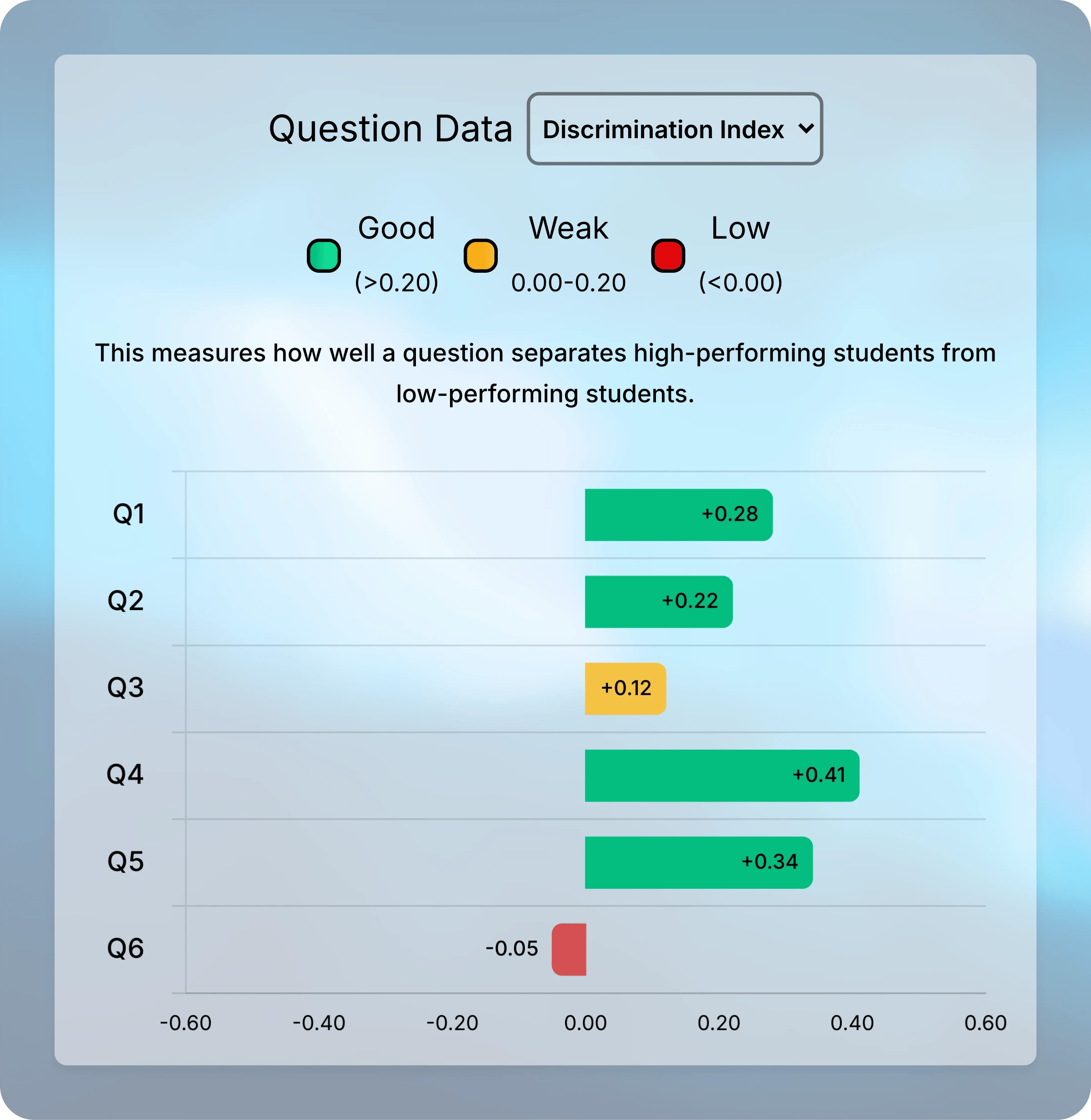
Choose what the bars show from the dropdown. Select a question’s bar or label to open that question in a new tab.
Average scores follow the assessment’s How should final grades be calculated? setting. With Maximum Attempt Score, for example, each student’s best attempt counts. Turn on Score Gain above the charts to compare first and final attempts.
- Difficulty
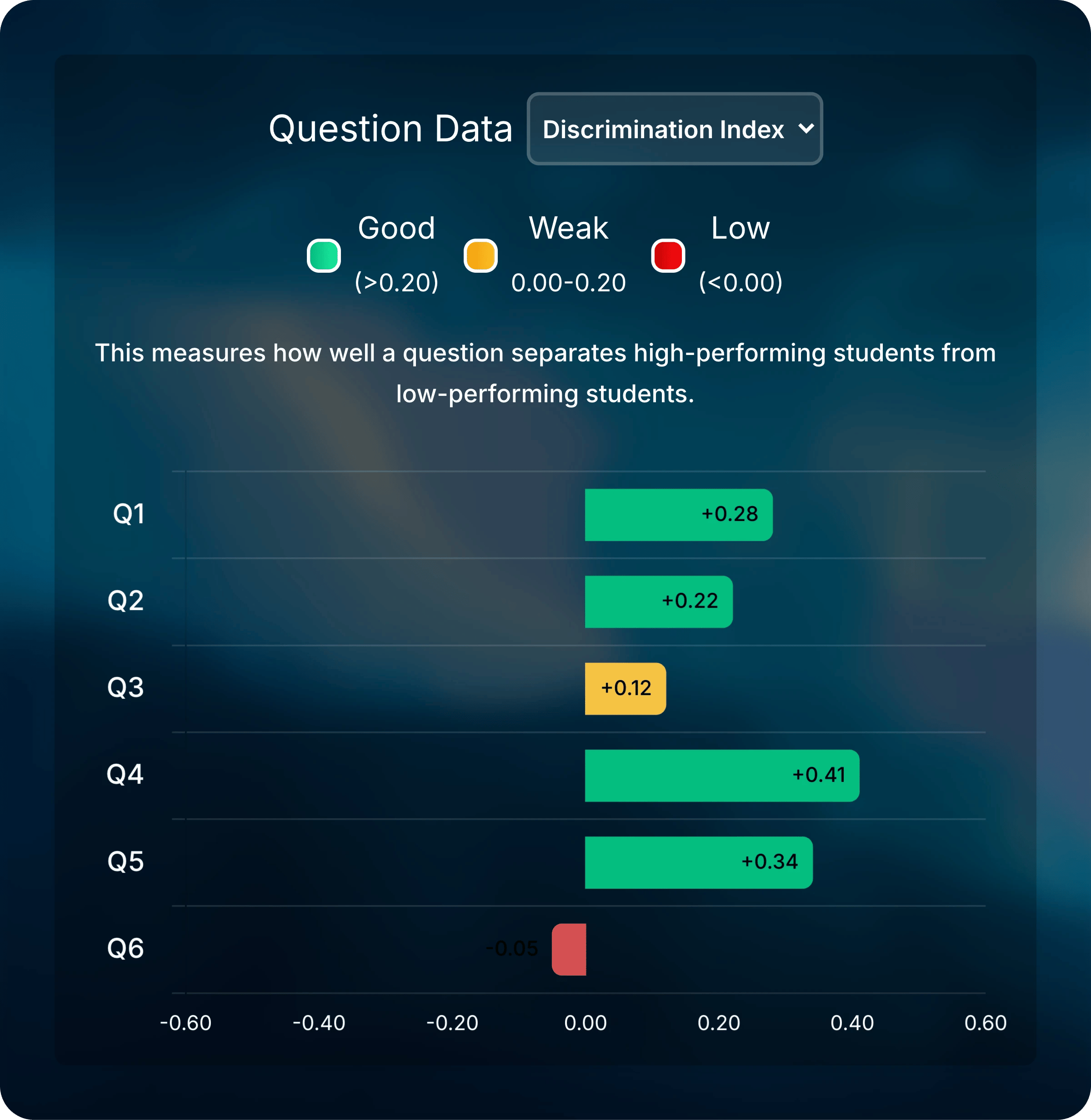
- Discrimination Index
- Tutor Effectiveness
Easy, Medium, and Hard compare each question with the others in the same assessment. Roughly the lowest-scoring quarter of questions is Hard, the highest-scoring quarter is Easy, and the rest are Medium.The legend shows the cutoffs. A question marked Hard in an easy quiz might still have a high average.
Review One Question
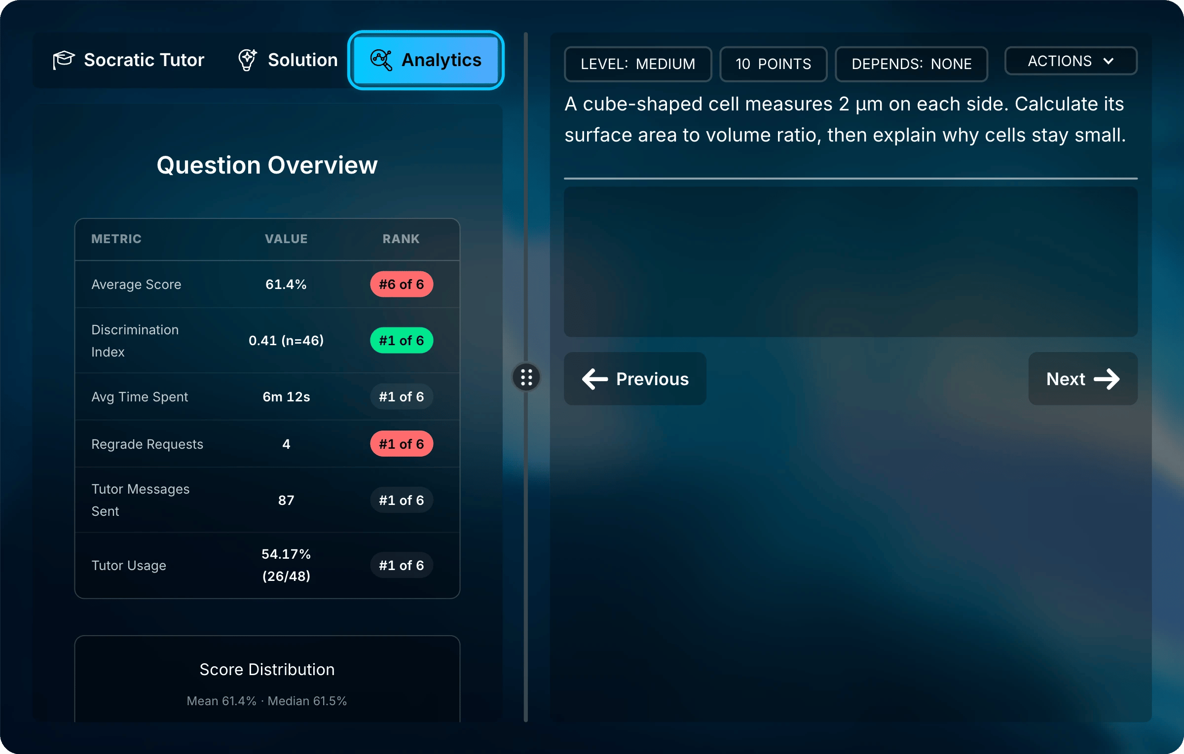
Select a question’s bar in Question Data, or open the assessment and go to the question. Then select Analytics in the panel beside the question. Only teachers see this tab.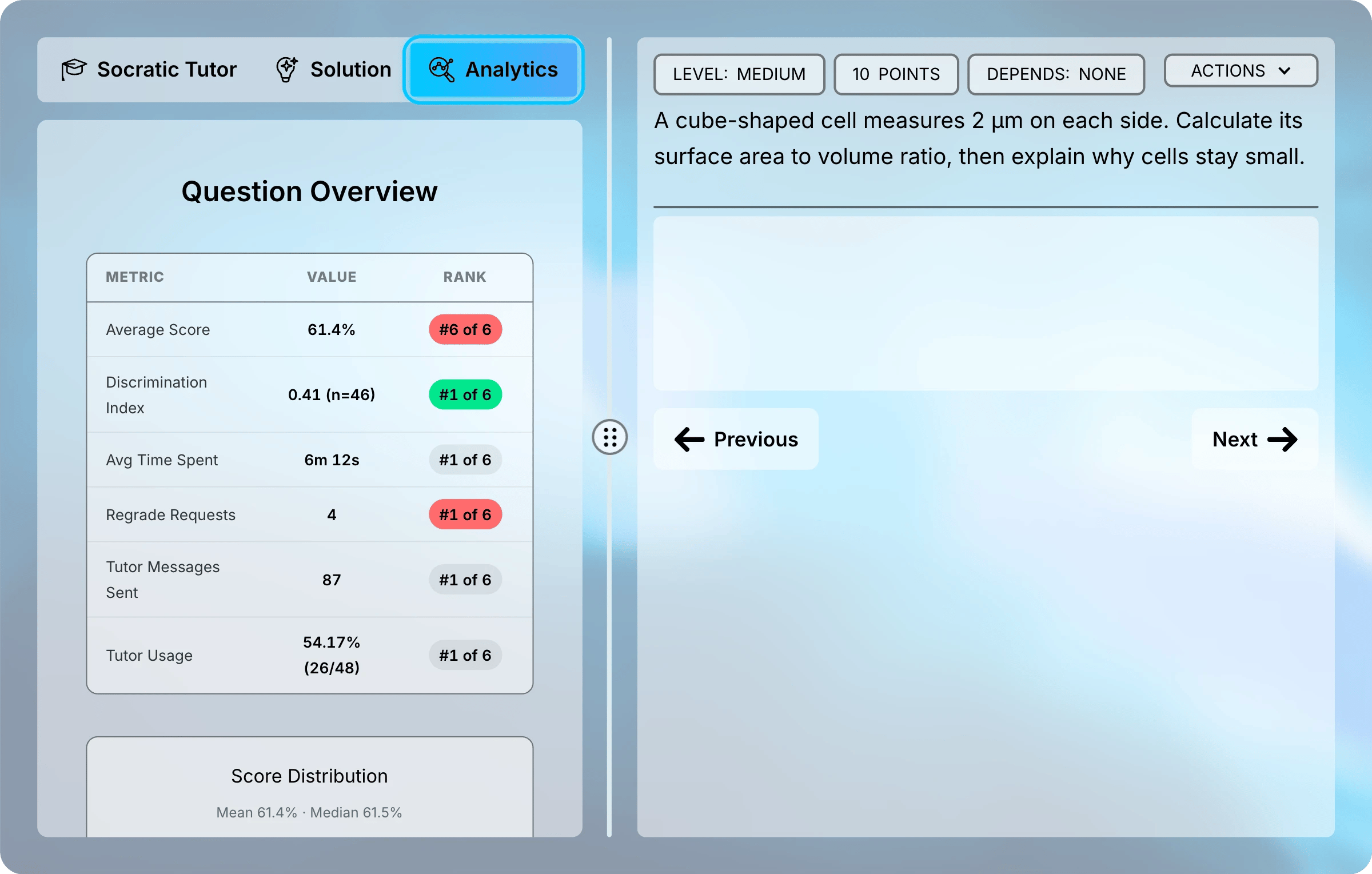
The Analytics tab sits next to Socratic Tutor and Solution.
Question Overview
The table at the top of the tab summarizes the question. Rank places it among the assessment’s questions, highest value first. For example, #6 of 6 on Average Score means the question had the lowest average.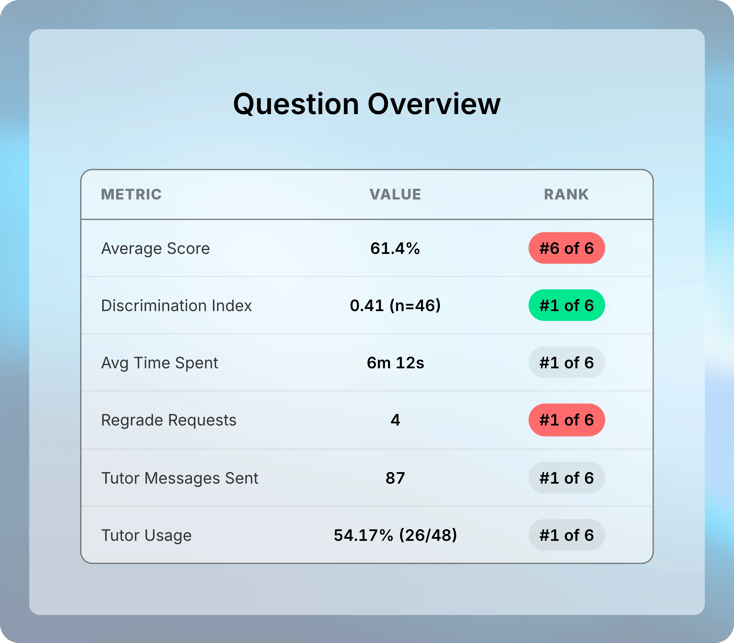
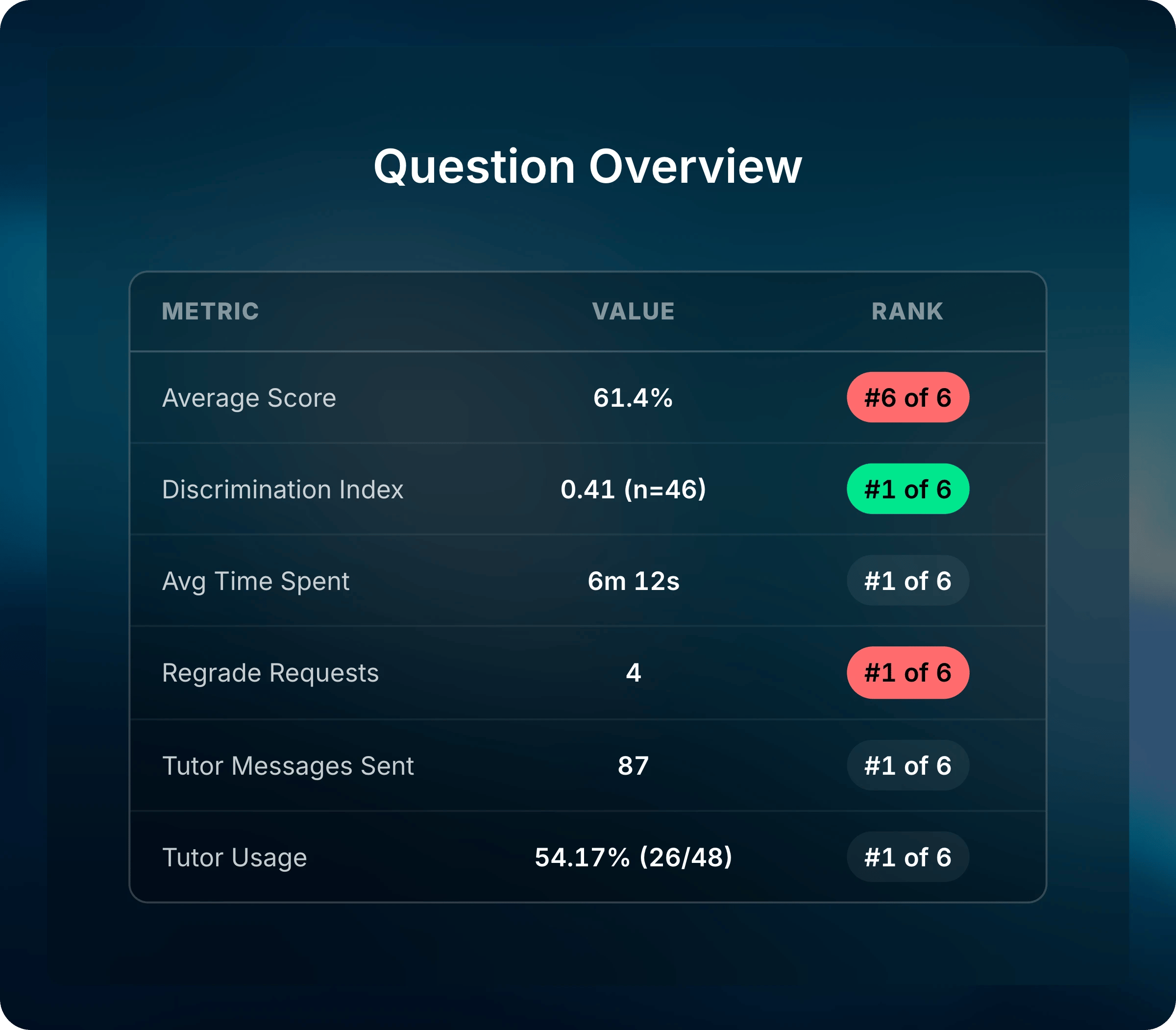
Question 4 has the lowest average and the most regrade requests.
Ranks for Average Score and Discrimination Index turn green in the top third and red in the bottom third. Regrade Requests works the other way: many requests turn red.
Charts
The charts below the table depend on how the question is graded. Uflo uses one attempt per student: the highest-scoring one with Maximum Attempt Score grading, and the most recent one otherwise.- Graded Instantly
- Graded by Rubric
Multiple choice, multiple correct choices, number, and math questions show a Response Breakdown. Each bar is one answer, and the correct answer is green. No response counts students who left it blank.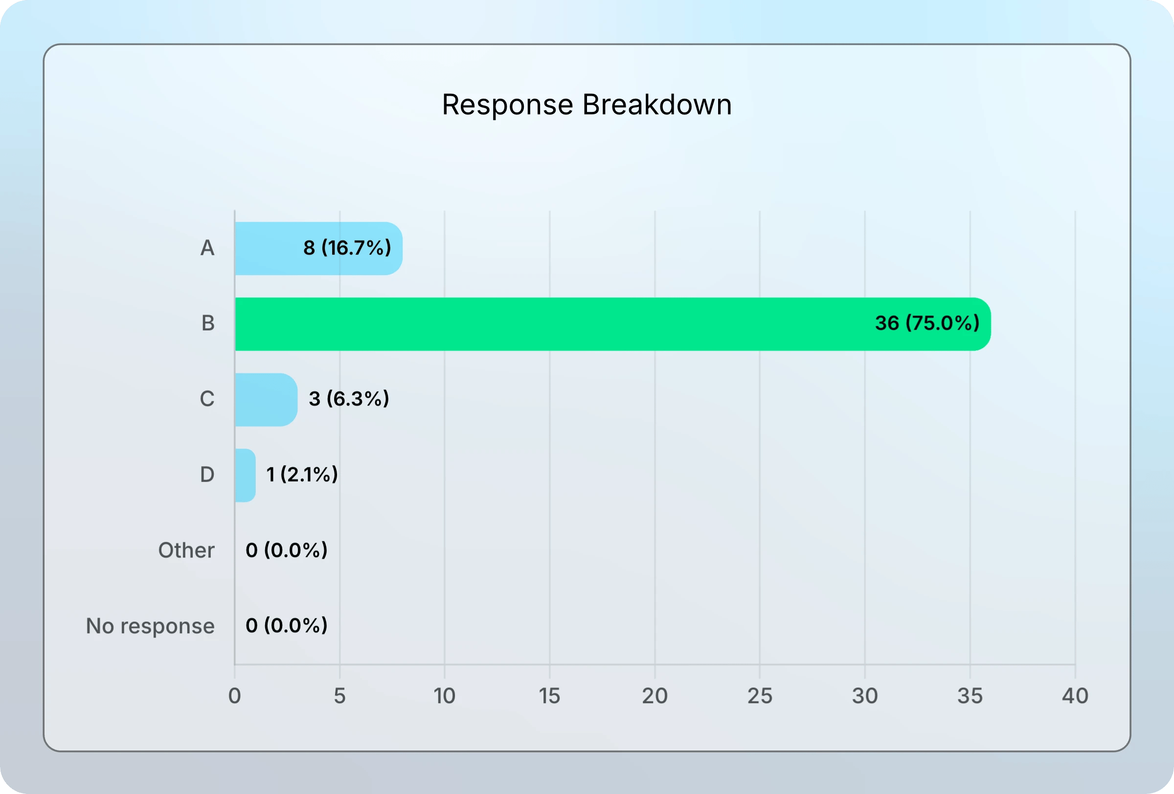
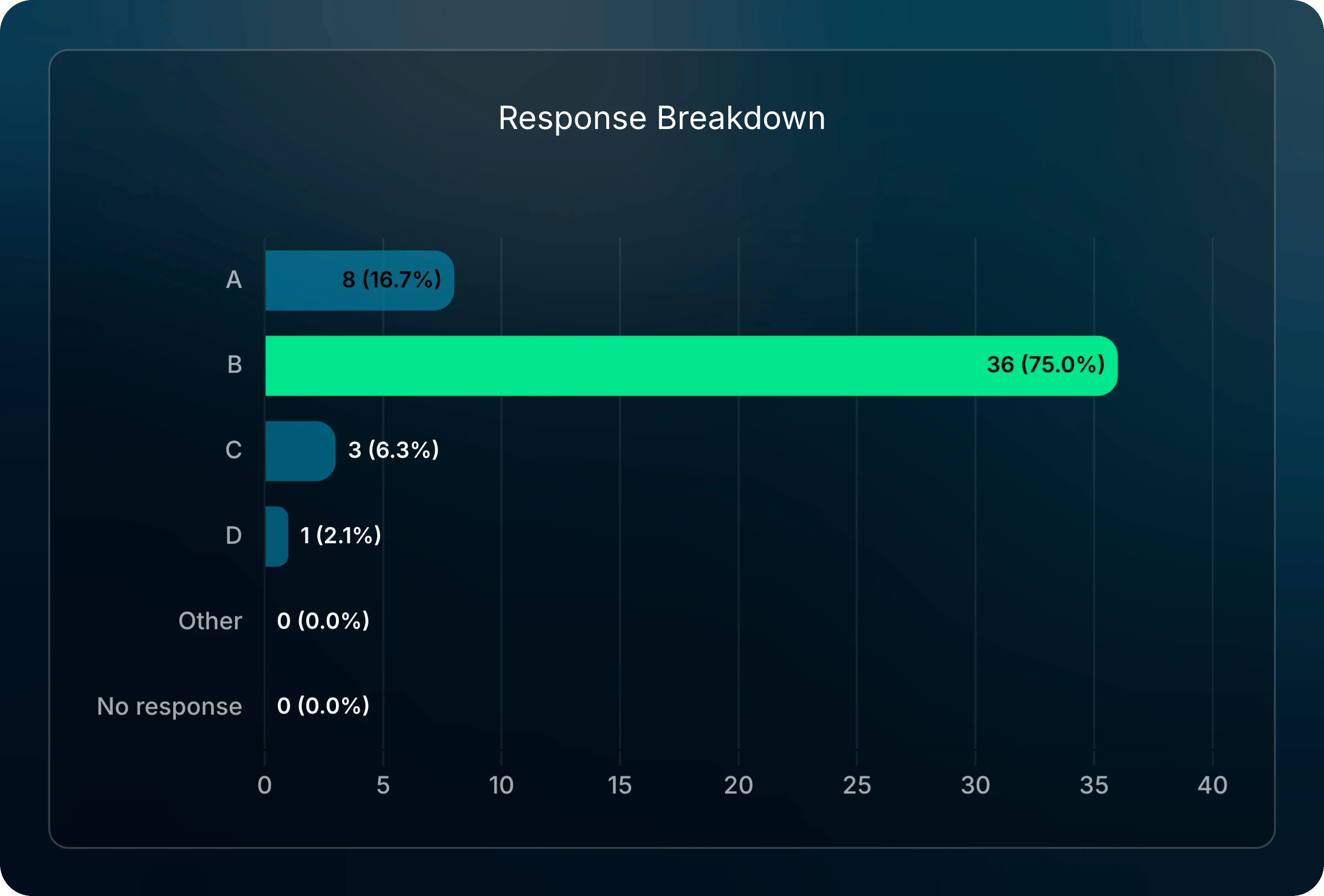
The correct answer, B, is green. Most students who missed it chose A.
- Number responses within the question’s margin of error share a bar.
- A math response shows green only when its text matches the answer key. An equivalent form, such as 2x + 2 for 2(x + 1), is graded correct but isn’t green.
- Fill-in-the-blank questions with more than one blank show a Correct Response Rate instead, with one bar per blank. Select a blank to see every answer given for it.
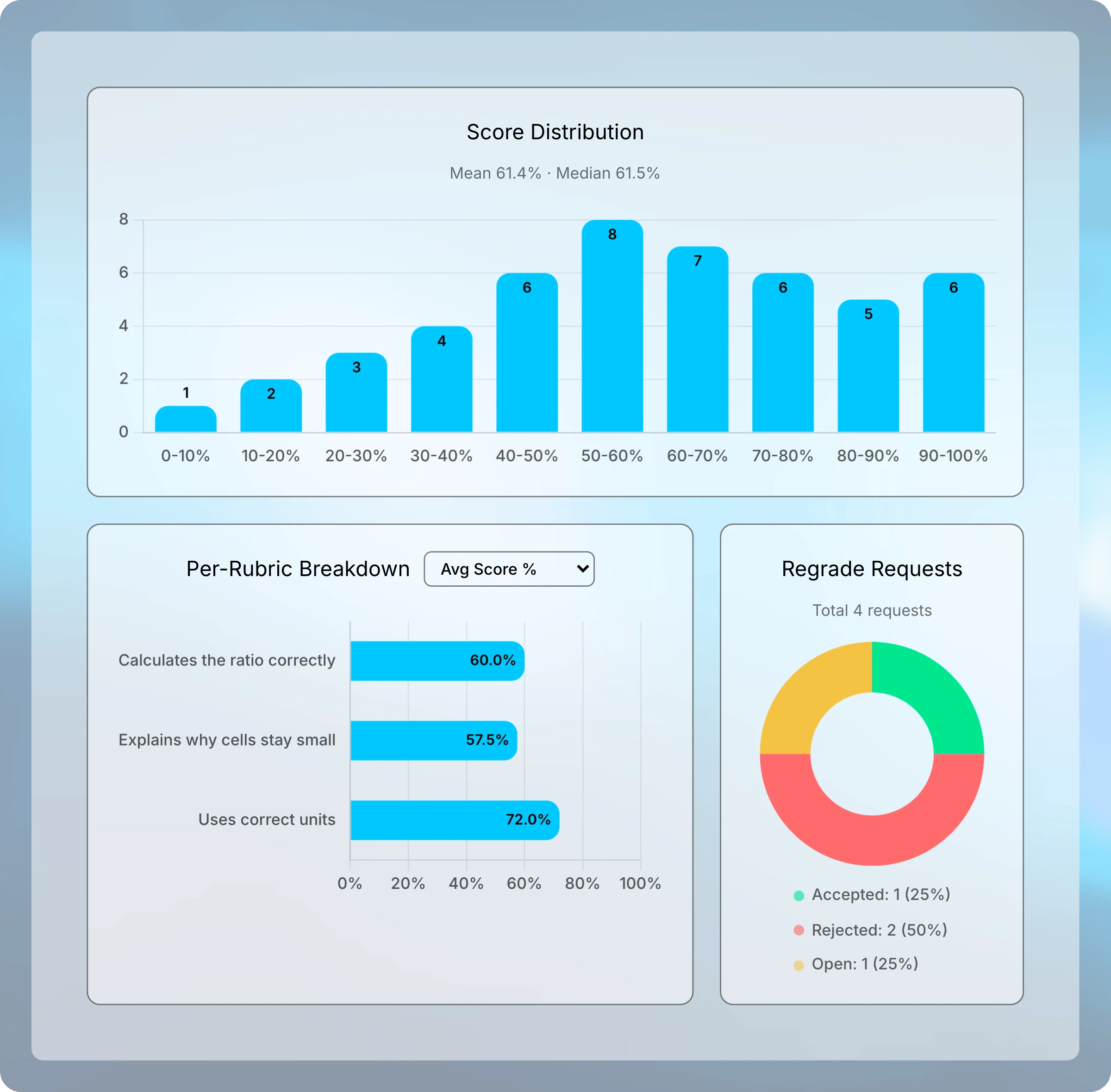
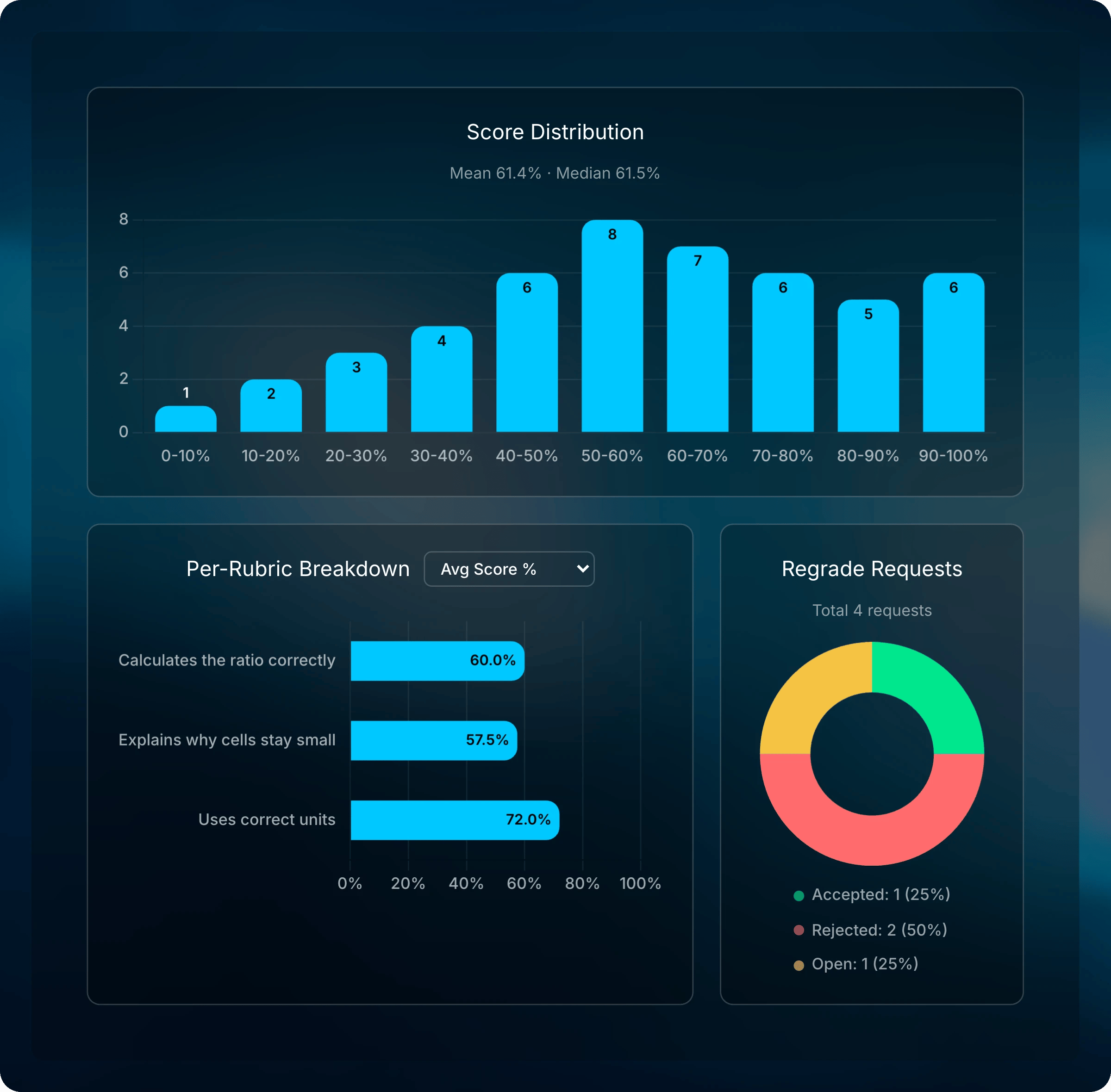
Find Patterns in Responses
For rubric-graded questions, Uflo can group the mistakes students made into patterns. When it has analyzed the class’s graded responses, the patterns appear under Response Summaries, below the charts. Each pattern sits under the rubric criterion where students lost points. Students who earned full marks on every attempt aren’t included, and neither are very short responses.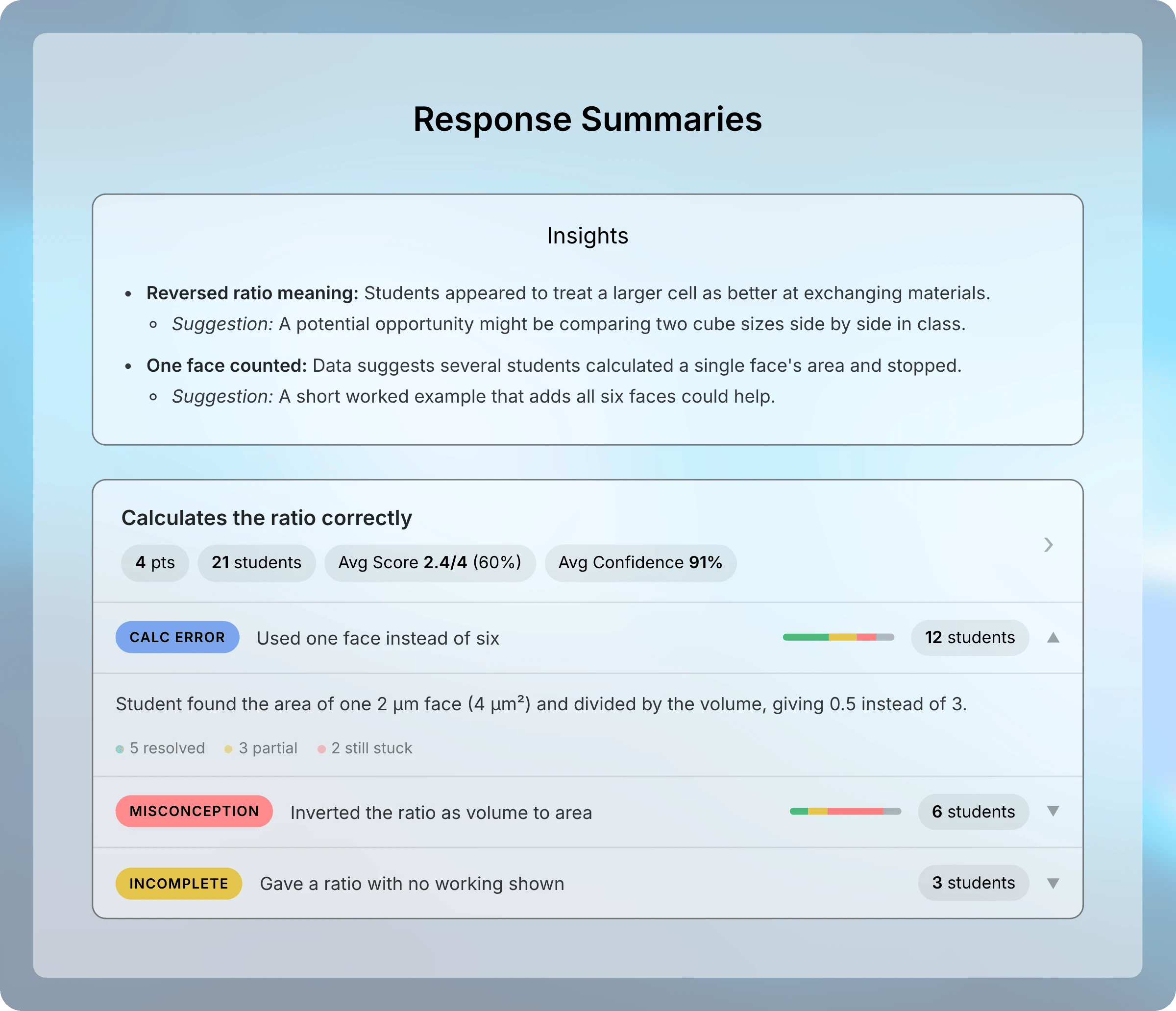
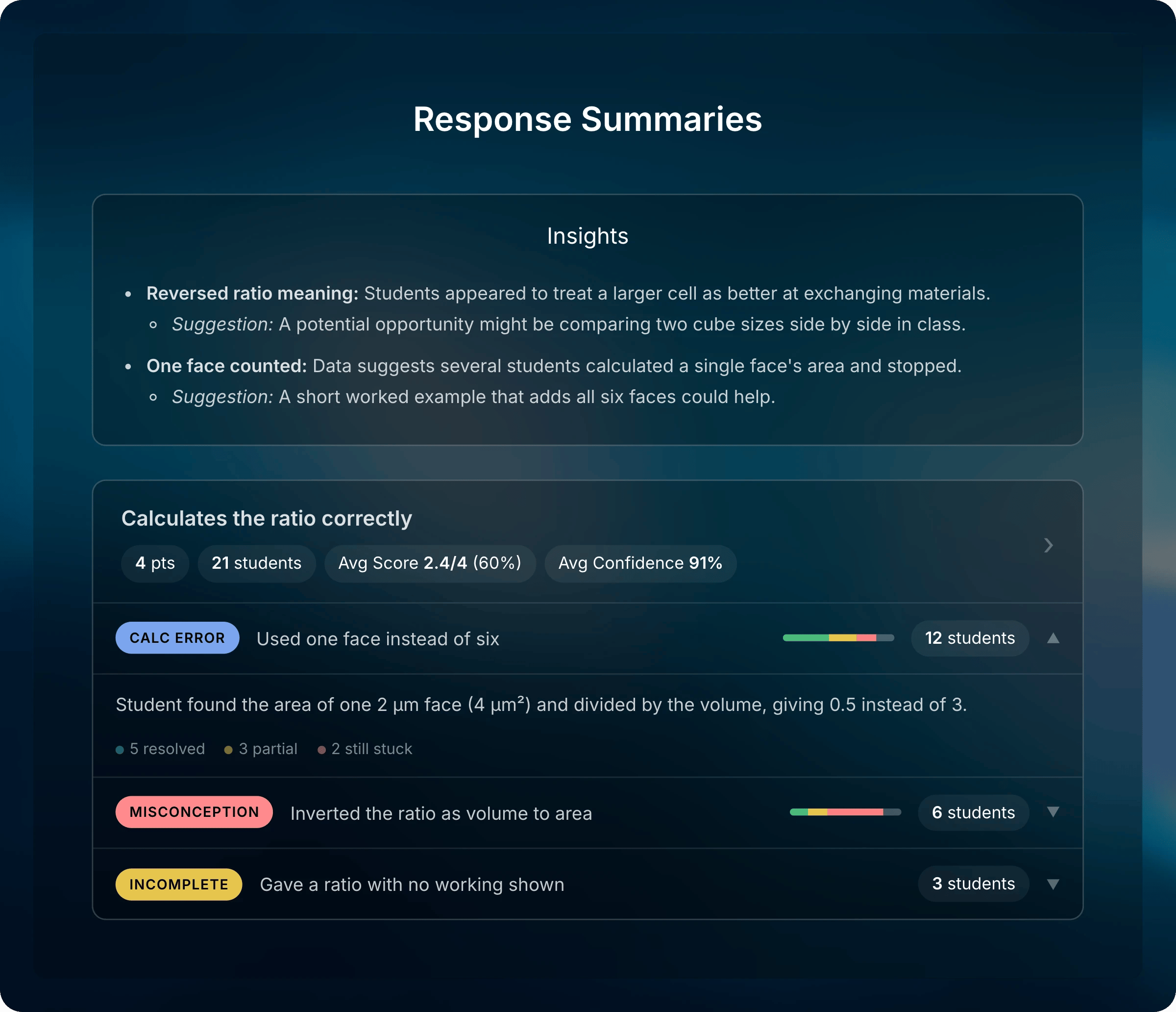
Each pattern shows its type, how many students it affects, and how many fixed it.
Select a criterion card’s header, or its bar in Per-Rubric Breakdown, to see that criterion’s pattern breakdown and score distribution.Pattern Types
Select a pattern to read its description. Select its students count to list the students in it.
Resolution
Uflo compares each student’s lowest-scoring attempt with their highest-scoring one. Each student in a pattern gets a status, and the small bar on the pattern row shows the mix.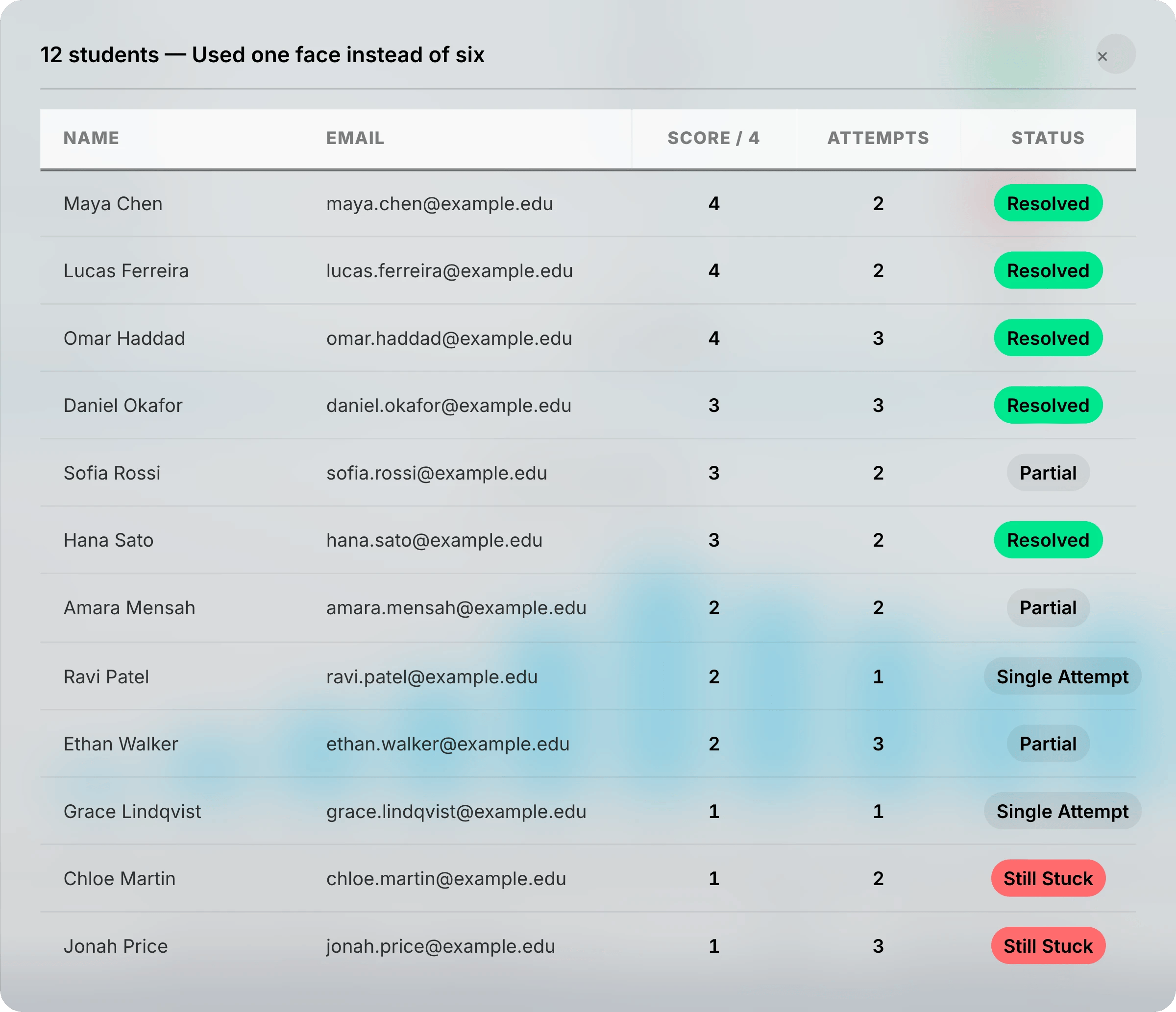
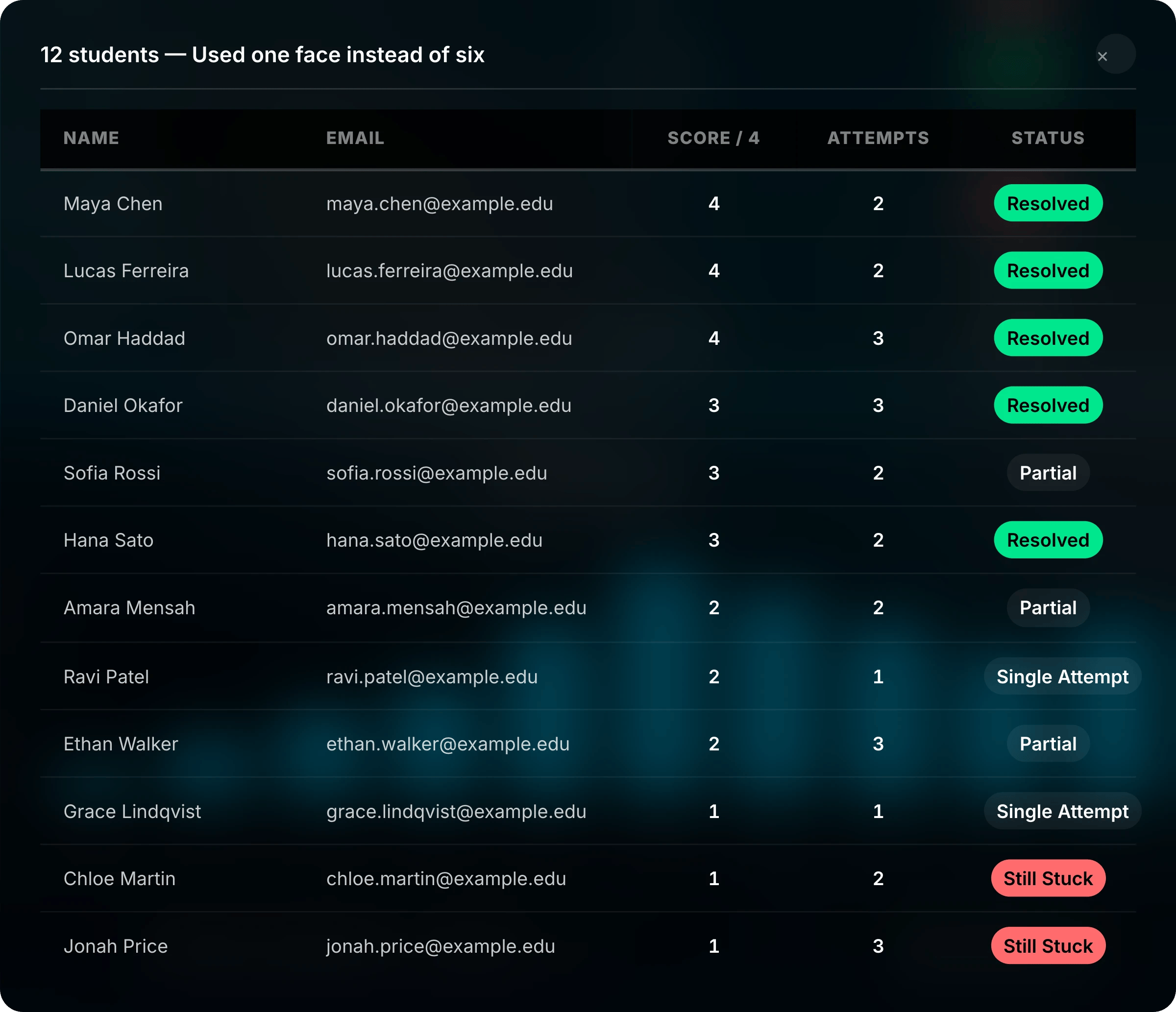
The Status column shows whether each student fixed the mistake in their highest-scoring attempt.
Patterns with many students still stuck are usually the best place to start. Select a student to open their submission and read the response yourself.
Insights
The Insights card suggests likely causes behind the patterns and what you could do in class. It gives more weight to mistakes students haven’t fixed. AI writes these suggestions, so read a few responses behind a pattern before you change your teaching or the rubric.What Each Path Supports
Scores, difficulty, and the discrimination index work for every assessment, including imported paper and LMS scores. Some data needs more:- Response Breakdown and Response Summaries need typed responses. Scanned paper assessments save each response as a page of the scan, so they don’t get either.
- Avg Time Spent needs students to answer in Uflo.
- Tutor Messages, Tutor Usage, and Tutor Effectiveness need students to use the Socratic Tutor on the question.
- Score Gain and pattern resolution need more than one attempt in Uflo.
Common Questions
Why don't I see the Analytics tab?
Why don't I see the Analytics tab?
Question groups don’t have one. Open one of the questions inside the group. The tab is also hidden when you switch to student view.
Why doesn't a question have Response Summaries?
Why doesn't a question have Response Summaries?
Response Summaries cover only written, drawing, and image questions worth points, and not scanned paper responses. They also need graded responses with mistakes to group, so a question most students answered fully may have none.
Why does a rank say N/A?
Why does a rank say N/A?
Every question in the assessment has zero for that metric. For example, Tutor Messages Sent shows N/A until a student messages the tutor about any question.